The November 13, 2012 Total Solar Eclipse

On November 13, 2012, a total eclipse of the Sun was visible from northern Australia and the southern Pacific Ocean. The center of the eclipse path began in Australia’s Northern Territory and traveled southeast before hitting the only major populous area: the city of Cairns. In Cairns the eclipse was visible for 2 minutes 11 seconds, starting at 06:38 AEST (local time) on November 14 (20:38 UTC on November 13), with the Sun lying a mere 14 degrees above the eastern horizon. After departing Australia, the path of the eclipse continued over the South Pacific Ocean. It reached its maximum duration of 4 minutes and 2 seconds at 22:13 UTC over the South Pacific Ocean, at which time the eclipse path was 180 km wide. The eclipse finally terminated at 23:48 UTC at a point approximately 800 km west of Chile. For a detailed description of the eclipse path, see NASA’s Eclipse page. For general information about eclipse photography, see Fred Espenak’s Eclipse web site.
On November 1, 2012 we started an MHD computation of the solar corona, in preparation for our prediction of what the solar corona would look like during this eclipse. We used data measured by the HMI magnetograph aboard NASA’s SDO spacecraft. We used a daily-updated HMI synoptic map from November 1, 2012, which has data for Carrington rotation 2129 combined with data from −60° to +60° of central meridian from a disk magnetogram measured up to 11:54 UTC on November 1, 2012.
A preliminary prediction of the state of the solar corona during the eclipse based on this data was posted on this web site on November 6, 2012. This preliminary prediction can be found here. On November 6, 2012 we started a new calculation with updated magnetic field data. We used daily-updated synoptic HMI data for a combination of Carrington rotations 2129 and 2130, measured up to 11:54 UT on November 5, 2012. This page has the updated (and final) prediction, which was posted on November 8, 2012.
That year, we also performed a computation using maps produced with the Air Force Data Assimilative Photospheric flux Transport (ADAPT) model developed by Nick Arge, Carl Henney, and co-workers. ADAPT ingests magnetograms from the National Solar Observatory’s SOLIS magnetograph at Kitt Peak. That model was still being tested, so its prediction (shown here) should be viewed as experimental.
Our prediction is based on a magnetohydrodynamic model of the solar corona with improved energy transport. We used this model for the first time to predict the structure of the corona prior to the March 29, 2006 total solar eclipse. Since then, we have predicted a number of other total eclipses. The improved energy equation model includes the effects of coronal heating, the conduction of heat parallel to the magnetic field lines, radiative losses, and the effect of Alfvén waves. This produces a significantly better estimate of the plasma temperature and density in the corona. For technical details about our model, please see the publications below.
You can read the technical details about the calculations that were used to make our predictions, and an account of our milestones in achieving the prediction.
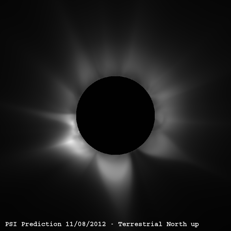
Predicted polarization brightness (pB) in the solar corona for the eclipse expected on November 13, 2012 at 22:13 UTC (corresponding to the moment of greatest eclipse in the Pacific Ocean). The state of the solar corona was computed using a 3D magnetohydrodynamic (MHD) simulation. The pB signal is produced by white light scattered off electrons in the coronal plasma. The image has been radially detrended using the Newkirk vignetting function to account for the fall-off of coronal brightness with distance from the Sun. Vertical (top) is terrestrial (geocentric) north. This is the view of the Sun that would be seen by an observer on Earth with a camera aligned so that vertical is toward the Earth’s north pole. Views aligned with solar north are on the original solar-north page.
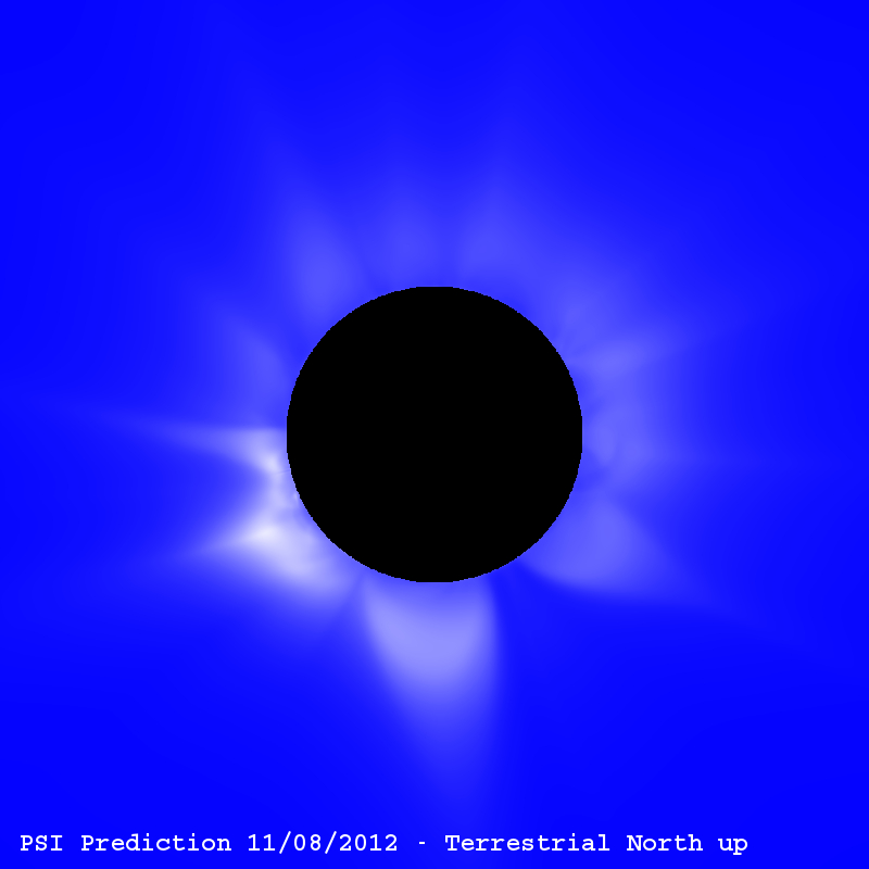
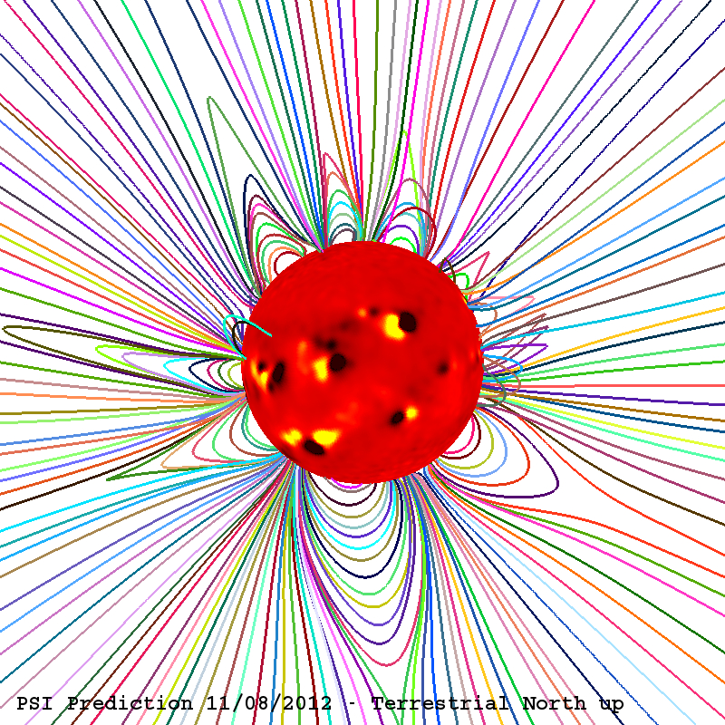
Predicted polarization brightness (left) together with traces of the magnetic field lines in the solar corona (right) for the eclipse expected on November 13, 2012 at 22:13 UTC (with terrestrial north up). The Sun’s surface shows color contours of the radial component of the measured photospheric magnetic field from the HMI magnetograph, showing the location of active regions (strong magnetic fields).
Evolution of the Photospheric Magnetic Field
The photospheric magnetic field maps we use for our calculations are built up from daily observations of the Sun during a solar rotation. These maps give a good approximation of the Sun’s magnetic flux if the large-scale flux does not change much throughout a rotation. Previously, we have computed coronal models for several eclipses during various phases of the solar cycle:
| Eclipse | Description |
|---|---|
| November 3, 1994 | Declining phase of solar cycle 22 |
| October 24, 1995 | Solar minimum between cycles 22 and 23 |
| March 9, 1997 | Solar minimum between cycles 22 and 23 |
| February 26, 1998 | Rising phase of solar cycle 23 |
| August 11, 1999 | Approaching solar maximum of cycle 23 |
| June 21, 2001 | Near solar maximum of cycle 23 |
| December 4, 2002 | Near solar maximum of cycle 23 |
| March 29, 2006 | Declining phase of solar cycle 23 |
| August 1, 2008 | Solar minimum between cycles 23 and 24 |
| July 22, 2009 | Solar minimum between cycles 23 and 24 |
| July 11, 2010 | Rising phase of solar cycle 24 |
This eclipse occurred during the approach to the solar maximum of cycle 24, so the solar corona would be expected to have a more complex structure than at solar minimum, as seen in our prediction.
The following figures show the evolution of the radial component (Br) of the solar photospheric magnetic field for approximately three Carrington rotations preceding the eclipse, as measured by the HMI magnetograph aboard NASA’s SDO spacecraft. The maps were suitably filled in the polar regions to account for missing data due to the tilt of the solar rotation axis. We also smooth the observed high-resolution data to a scale that is appropriate for our calculations by diffusing the radial component of the magnetic field. For this time period, the northern polar region of the Sun was better observed than the southern polar region. We filled missing data in the southern polar region from older data (from an average between CR2120 and CR2121, which were observed in February and March 2012).
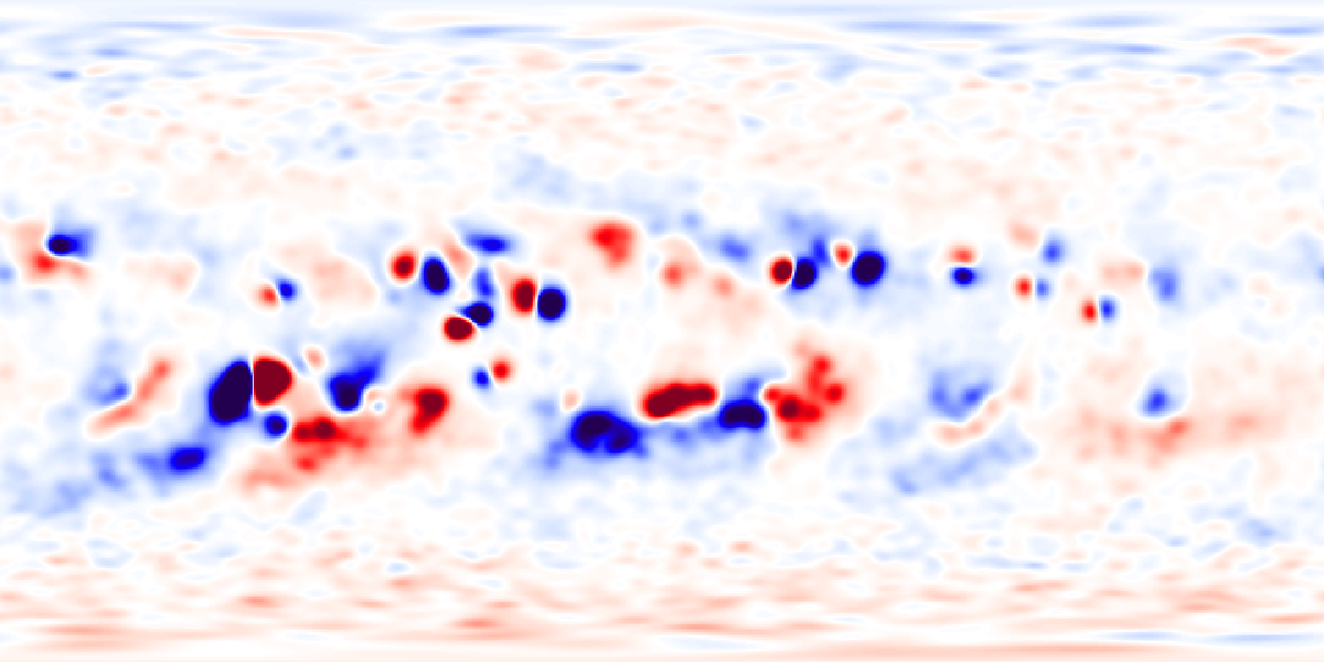
CR 2127 (August 15 – September 11, 2012)
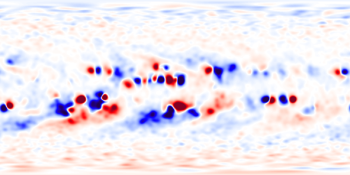
CR 2128 (September 11 – October 8, 2012)
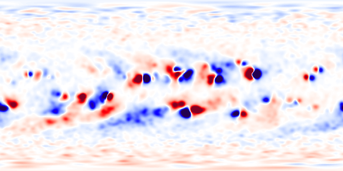
CR 2129 + Nov. 5 Frontside Data (October 13 – November 5, 2012)
These maps show the radial component of the magnetic field (Br) deduced from the measured line-of-sight component of the photospheric field as a function of latitude and Carrington longitude. Red shows magnetic field directed out of the Sun; blue shows magnetic field directed into the Sun. For our final eclipse prediction we used the data in the last figure: a daily-updated HMI synoptic map with data for Carrington rotation 2129 combined with data from −60° to +60° of central meridian from a disk magnetogram measured up to 11:54 UTC on November 5, 2012.
It is apparent that the Sun’s photospheric magnetic field was evolving rapidly during this time of the solar cycle, with active regions emerging frequently and evolving considerably from one solar rotation to the next. This evolution necessarily makes our prediction less accurate, since we use data measured many days in advance of the eclipse to simulate the structure of the corona. The choice of time lag between when we issue our prediction and the time of the eclipse is influenced by our desire to provide sufficient advance notice to observers and the public, and the time it takes us to run an MHD simulation and process the results.
Images and Movies of Coronal Emission in EUV and X-Rays
Our 3D MHD model with improved energy transport allows us to simulate the emission from the corona in extreme ultraviolet and X-ray wavelengths. The Sun can be observed in these wavelengths from space. In particular, the SOHO/EIT, STEREO/EUVI, and Hinode/EIS telescopes routinely take EUV images of the solar corona, and the Hinode/XRT telescope images the soft X-ray Sun. Our simulated coronal emission is available on the original emission page.
Movies of Polarization Brightness
We have made movies of the polarization brightness (pB) from our MHD simulation. This illustrates visually how the solar corona changes as a result of solar rotation. The left movie shows pB in grayscale with a black disk occulting the Sun; the right shows pB with a blue background.
Polarization Brightness(grayscale)
Polarization Brightness(blue background)
Publications
For technical details about our model, please see the following publications:
- Z. Mikić, J. A. Linker, D. D. Schnack, R. Lionello, and A. Tarditi, “Magnetohydrodynamic Modeling of the Global Solar Corona,” Physics of Plasmas, 6, 2217 (1999).
- Z. Mikić, J. A. Linker, P. Riley, and R. Lionello, “Predicting the Structure of the Solar Corona During the 11 August 1999 Total Solar Eclipse,” in The Last Total Solar Eclipse of the Millennium (W. Livingston and A. Ozguc, eds.), ASP Conference Series, Vol. 205, p. 162 (2000). Download PDF
- Z. Mikić, J. A. Linker, R. Lionello, P. Riley, and V. Titov, “Predicting the Structure of the Solar Corona for the Total Solar Eclipse of March 29, 2006,” in Solar and Stellar Physics Through Eclipses (O. Demircan, S. O. Selam, and B. Albayrak, eds.), ASP Conference Series, Vol. 370, p. 299 (2007). Download PDF
- R. Lionello, J. A. Linker, and Z. Mikić, “Multispectral Emission of the Sun During the First Whole Sun Month: Magnetohydrodynamic Simulations,” Astrophys. J., 690, 902 (2009). Access Article
- V. Rušin, M. Druckmüller, P. Aniol, M. Minarovjech, M. Saniga, Z. Mikić, J. A. Linker, R. Lionello, P. Riley, and V. S. Titov, “Comparing Eclipse Observations of the 2008 August 1 Solar Corona with an MHD Model Prediction,” Astron. Astrophys., 513, A45 (2010). Access Article
Acknowledgments
Our work is supported by NASA, AFOSR, and NSF through the Strategic Capabilities program, by NASA’s Heliophysics Theory Program (HTP), by the Center for Integrated Space Weather Modeling (an NSF Science and Technology Center), by NASA’s Supporting Research and Technology (SR&T) Program, and by NASA’s Living With a Star (LWS) Program. We are grateful to NASA’s Advanced Supercomputing Division (NAS) for an allocation on the Pleiades supercomputer, and the Texas Advanced Computing Center (TACC) for an allocation on the Ranger supercomputer. Our calculations for the eclipse prediction were performed on these computers. We thank the SDO/HMI team of the Solar Physics Group at Stanford University for their superb efforts in providing timely access to HMI synoptic magnetograph data.
Archived prediction, converted from the original 2012 page. Movies originally offered as GIF/QuickTime downloads are embedded above.